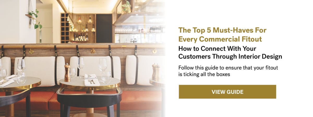
Design for the senses.
Case study after case study shows us that a well-designed space attracts more customers and achieves more sales than a tired looking interior. Often as customers, we don't always pinpoint what it is about a space that makes us want to linger in it a little longer, or spend a little more. What we know is that at its most basic level, this motivation stems from feelings of comfort, aesthetic pleasure, and full sense engagement.
The built space is unique in that it is the one place where all of your five senses are engaged. From the smell of coffee, to tantalising visuals of a food theatre, the touch of a textured menu, ambient music in your ears, and the crunch of something delightful, it is one of the only places where we are able to experience a brand in its entirety. Well-designed interiors directly play to this full engagement of the five senses.As designers, we've dissected the precise touchpoints that contribute to creating this feeling for customers. Over the years, we've experimented with a little bit of this, and a little bit of that - materials, lighting, finishes, consultants, you name it - to come up with the perfect mix of things that should never be overlooked when designing a commercial fitout. Be it a restaurant, bar, cafe, shop, kiosk, or office, these elements remain as the Top 5.
To find out how to connect with your customers' senses through interior design, download this guide. Pssst...we're also giving away a list of our favourite suppliers for each must-have. See how your fitout stacks up today!

